Plot
Functions that generate plots
clarite.plot.histogram(data, column: str, figsize: Tuple[int, int] = (12, 5), title: Optional[str] = None, figure: Optional[matplotlib.pyplot.figure] = None, **kwargs)¶Plot a histogram of the values in the given column.
- Parameters
- data: pd.DataFrame
The DataFrame containing data to be plotted
- column: string
The name of the column that will be plotted
- figsize: tuple(int, int), default (12, 5)
The figure size of the resulting plot
- title: string or None, default None
The title used for the plot
- figure: matplotlib Figure or None, default None
Pass in an existing figure to plot to that instead of creating a new one (ignoring figsize)
- **kwargs:
Other keyword arguments to pass to the histplot or catplot function of Seaborn
- Returns
- None
Examples
>>> import clarite
>>> title = f"Discovery: Skew of BMIMBX = {stats.skew(nhanes_discovery_cont['BMXBMI']):.6}"
>>> clarite.plot.histogram(nhanes_discovery_cont, column="BMXBMI", title=title, bins=100)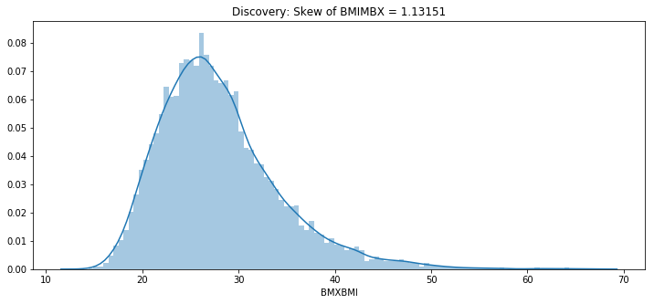
clarite.plot.distributions(data, filename: str, continuous_kind: str = 'count', nrows: int = 4, ncols: int = 3, quality: str = 'medium', variables: Optional[List[str]] = None, sort: bool = True)¶Create a pdf containing histograms for each binary or categorical variable, and one of several types of plots for each continuous variable.
- Parameters
- data: pd.DataFrame
The DataFrame containing data to be plotted
- filename: string or pathlib.Path
Name of the saved pdf file. The extension will be added automatically if it was not included.
- continuous_kind: string
What kind of plots to use for continuous data. Binary and Categorical variables will always be shown with histograms. One of {‘count’, ‘box’, ‘violin’, ‘qq’}
- nrows: int (default=4)
Number of rows per page
- ncols: int (default=3)
Number of columns per page
- quality: ‘low’, ‘medium’, or ‘high’
Adjusts the DPI of the plots (150, 300, or 1200)
- variables: List[str] or None
Which variables to plot. If None, all variables are plotted.
- sort: Boolean (default=True)
Whether or not to sort variable names
- Returns
- None
Examples
>>> import clarite >>> clarite.plot.distributions(df[['female', 'occupation', 'LBX074']], filename="test")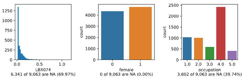 >>> clarite.plot.distributions(df[['female', 'occupation', 'LBX074']], filename="test", continuous_kind='box')
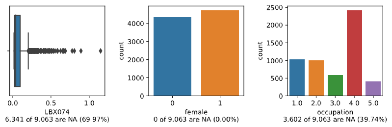 >>> clarite.plot.distributions(df[['female', 'occupation', 'LBX074']], filename="test", continuous_kind='violin')
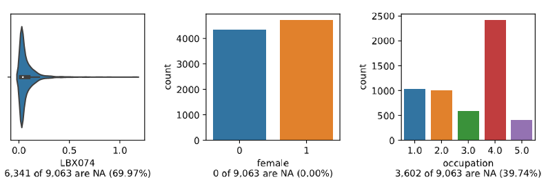 >>> clarite.plot.distributions(df[['female', 'occupation', 'LBX074']], filename="test", continuous_kind='qq')
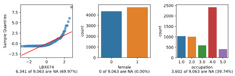
clarite.plot.manhattan(dfs: Dict[str, pandas.core.frame.DataFrame], categories: Optional[Dict[str, str]] = None, bonferroni: Optional[float] = 0.05, fdr: Optional[float] = None, num_labeled: int = 3, label_vars: Optional[List[str]] = None, figsize: Tuple[int, int] = (12, 6), dpi: int = 300, title: Optional[str] = None, figure: Optional[matplotlib.pyplot.figure] = None, colors: List[str] = ['#53868B', '#4D4D4D'], background_colors: List[str] = ['#EBEBEB', '#FFFFFF'], filename: Optional[str] = None, return_figure: bool = False)¶Create a Manhattan-like plot for a list of EWAS Results
- Parameters
- dfs: DataFrame
Dictionary of dataset names to pandas dataframes of ewas results (requires certain columns)
- categories: dictionary (string: string) or None
A dictionary mapping each variable name to a category name for optional grouping
- bonferroni: float or None (default 0.05)
Show a cutoff line at the pvalue corresponding to a given bonferroni-corrected pvalue
- fdr: float or None (default None)
Show a cutoff line at the pvalue corresponding to a given fdr
- num_labeled: int, default 3
Label the top <num_labeled> results with the variable name
- label_vars: list of strings, default None
Label the named variables (or pass None to skip labeling this way)
- figsize: tuple(int, int), default (12, 6)
The figure size of the resulting plot in inches
- dpi: int, default 300
The figure dots-per-inch
- title: string or None, default None
The title used for the plot
- figure: matplotlib Figure or None, default None
Pass in an existing figure to plot to that instead of creating a new one (ignoring figsize and dpi)
- colors: List(string, string), default [“#53868B”, “#4D4D4D”]
A list of colors to use for alternating categories (must be same length as ‘background_colors’)
- background_colors: List(string, string), default [“#EBEBEB”, “#FFFFFF”]
A list of background colors to use for alternating categories (must be same length as ‘colors’)
- filename: Optional str
If provided, a copy of the plot will be saved to the specified file instead of being shown
- return_figure: boolean, default False
If True, return figure instead of showing or saving the plot. Useful to customize the plot
- Returns
- figure: matplotlib Figure or None
If return_figure, returns a matplotlib Figure object. Else returns None
Examples
>>> clarite.plot.manhattan({'discovery':disc_df, 'replication':repl_df}, categories=data_categories, title="EWAS Results")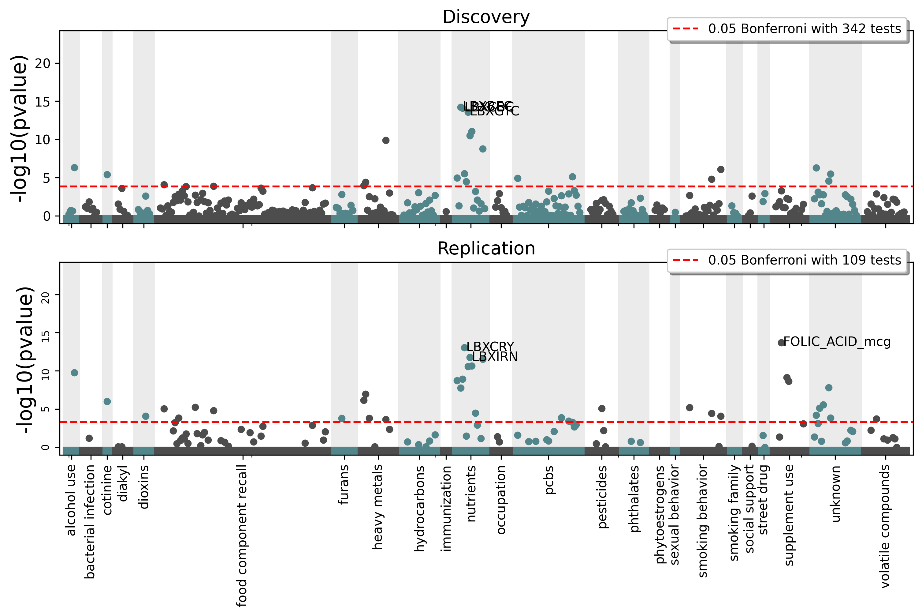
clarite.plot.manhattan_fdr(dfs: Dict[str, pandas.core.frame.DataFrame], categories: Optional[Dict[str, str]] = None, cutoff: Optional[float] = 0.05, num_labeled: int = 3, label_vars: Optional[List[str]] = None, figsize: Tuple[int, int] = (12, 6), dpi: int = 300, title: Optional[str] = None, figure: Optional[matplotlib.pyplot.figure] = None, colors: List[str] = ['#53868B', '#4D4D4D'], background_colors: List[str] = ['#EBEBEB', '#FFFFFF'], filename: Optional[str] = None, return_figure: bool = False)¶Create a Manhattan-like plot for a list of EWAS Results using FDR significance
- Parameters
- dfs: DataFrame
Dictionary of dataset names to pandas dataframes of ewas results (requires certain columns)
- categories: dictionary (string: string) or None
A dictionary mapping each variable name to a category name for optional grouping
- cutoff: float or None (default 0.05)
The pvalue to draw the FDR significance line at (None for no line)
- num_labeled: int, default 3
Label the top <num_labeled> results with the variable name
- label_vars: list of strings, default None
Label the named variables (or pass None to skip labeling this way)
- figsize: tuple(int, int), default (12, 6)
The figure size of the resulting plot in inches
- dpi: int, default 300
The figure dots-per-inch
- title: string or None, default None
The title used for the plot
- figure: matplotlib Figure or None, default None
Pass in an existing figure to plot to that instead of creating a new one (ignoring figsize and dpi)
- colors: List(string, string), default [“#53868B”, “#4D4D4D”]
A list of colors to use for alternating categories (must be same length as ‘background_colors’)
- background_colors: List(string, string), default [“#EBEBEB”, “#FFFFFF”]
A list of background colors to use for alternating categories (must be same length as ‘colors’)
- filename: Optional str
If provided, a copy of the plot will be saved to the specified file instead of being shown
- return_figure: boolean, default False
If True, return figure instead of showing or saving the plot. Useful to customize the plot
- Returns
- figure: matplotlib Figure or None
If return_figure, returns a matplotlib Figure object. Else returns None
Examples
>>> clarite.plot.manhattan_fdr({'discovery':disc_df, 'replication':repl_df},
 categories=data_categories, title="EWAS Results")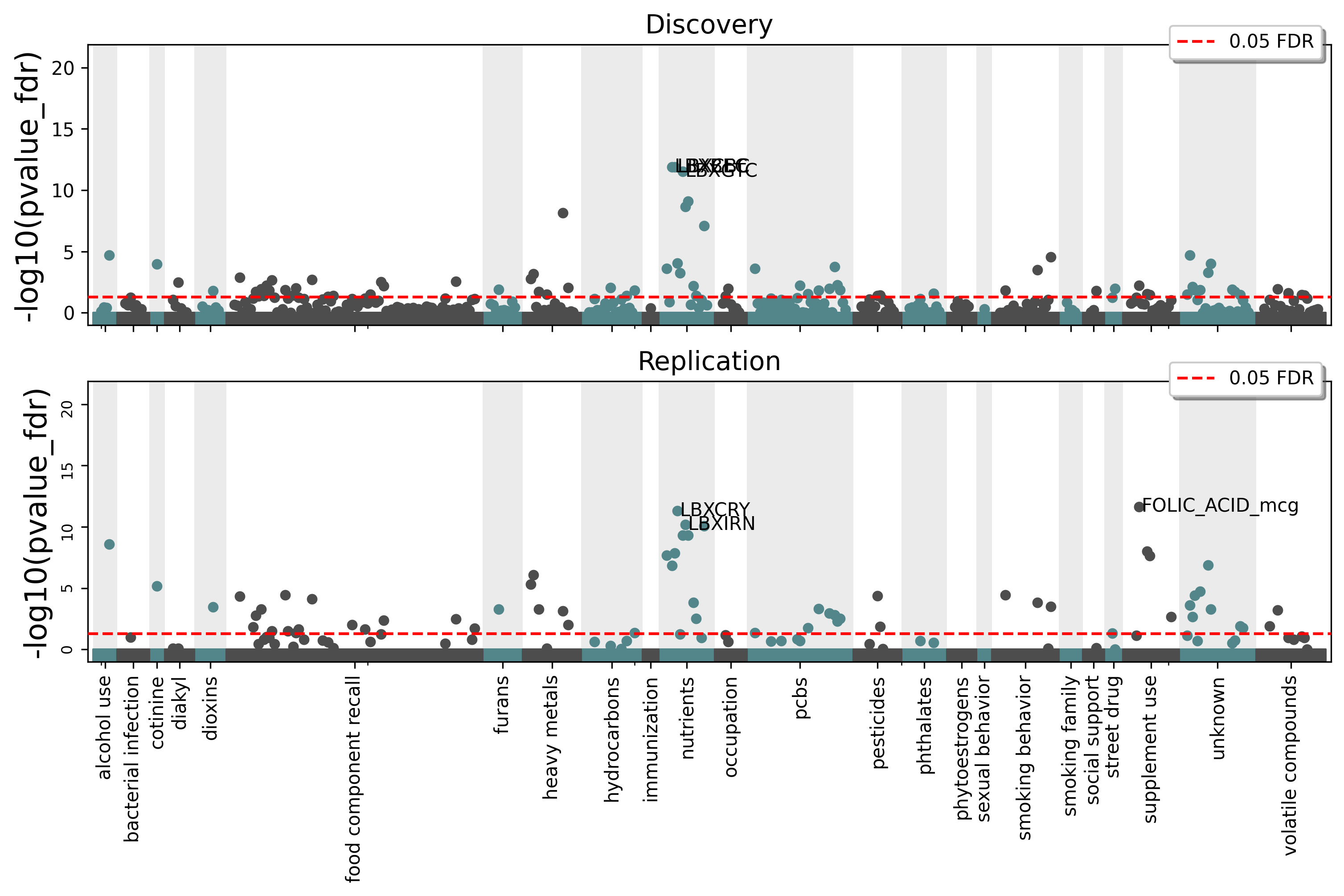
clarite.plot.manhattan_bonferroni(dfs: Dict[str, pandas.core.frame.DataFrame], categories: Optional[Dict[str, str]] = None, cutoff: Optional[float] = 0.05, num_labeled: int = 3, label_vars: Optional[List[str]] = None, figsize: Tuple[int, int] = (12, 6), dpi: int = 300, title: Optional[str] = None, figure: Optional[matplotlib.pyplot.figure] = None, colors: List[str] = ['#53868B', '#4D4D4D'], background_colors: List[str] = ['#EBEBEB', '#FFFFFF'], filename: Optional[str] = None, return_figure: bool = False)¶Create a Manhattan-like plot for a list of EWAS Results using Bonferroni significance
- Parameters
- dfs: DataFrame
Dictionary of dataset names to pandas dataframes of ewas results (requires certain columns)
- categories: dictionary (string: string) or None
A dictionary mapping each variable name to a category name for optional grouping
- cutoff: float or None (default 0.05)
The pvalue to draw the Bonferroni significance line at (None for no line)
- num_labeled: int, default 3
Label the top <num_labeled> results with the variable name
- label_vars: list of strings, default None
Label the named variables (or pass None to skip labeling this way)
- figsize: tuple(int, int), default (12, 6)
The figure size of the resulting plot in inches
- dpi: int, default 300
The figure dots-per-inch
- title: string or None, default None
The title used for the plot
- figure: matplotlib Figure or None, default None
Pass in an existing figure to plot to that instead of creating a new one (ignoring figsize and dpi)
- colors: List(string, string), default [“#53868B”, “#4D4D4D”]
A list of colors to use for alternating categories (must be same length as ‘background_colors’)
- background_colors: List(string, string), default [“#EBEBEB”, “#FFFFFF”]
A list of background colors to use for alternating categories (must be same length as ‘colors’)
- filename: Optional str
If provided, a copy of the plot will be saved to the specified file instead of being shown
- return_figure: boolean, default False
If True, return figure instead of showing or saving the plot. Useful to customize the plot
- Returns
- figure: matplotlib Figure or None
If return_figure, returns a matplotlib Figure object. Else returns None
Examples
>>> clarite.plot.manhattan_bonferroni({'discovery':disc_df, 'replication':repl_df},
 categories=data_categories, title="EWAS Results")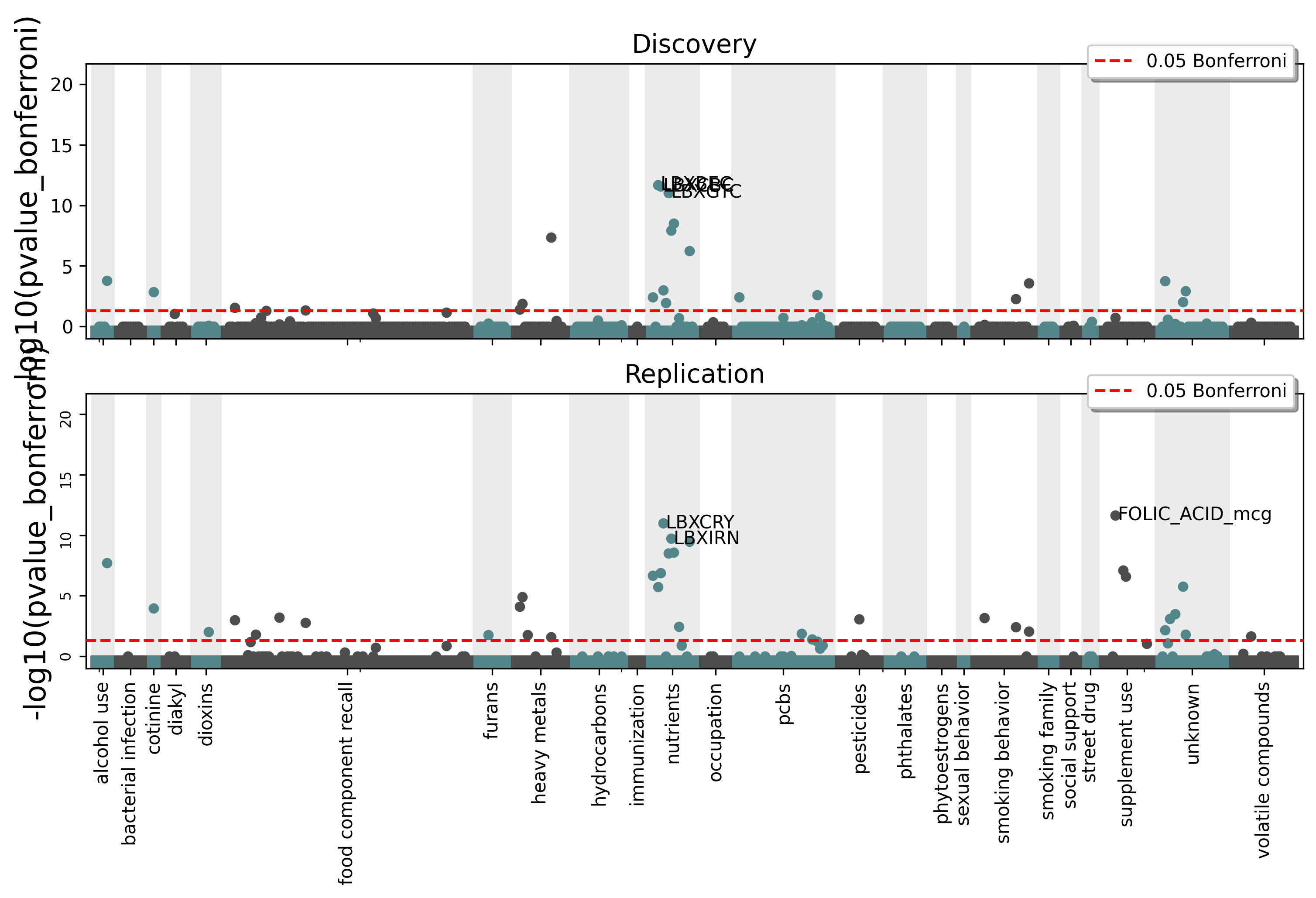
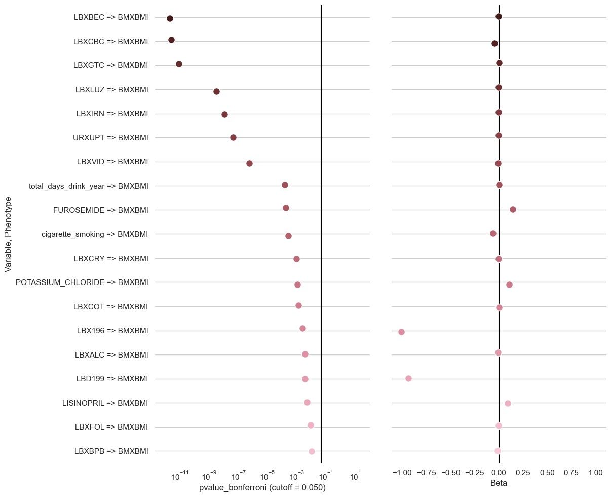
clarite.plot.top_results(ewas_result: pandas.core.frame.DataFrame, pvalue_name: str = 'pvalue', cutoff: Optional[float] = 0.05, num_rows: int = 20, figsize: Optional[Tuple[int, int]] = None, dpi: int = 300, title: Optional[str] = None, figure: Optional[matplotlib.pyplot.figure] = None, filename: Optional[str] = None)¶Create a dotplot for EWAS Results showing pvalues and beta coefficients
- Parameters
- ewas_result: DataFrame
EWAS Result to plot
- pvalue_name: str
‘pvalue’, ‘pvalue_fdr’, or ‘pvalue_bonferroni’
- cutoff: float (default 0.05)
A vertical line is drawn in the pvalue column to show a significance cutoff
- num_rows: int (default 20)
How many rows to show in the plot
- figsize: tuple(int, int), default (12, 6)
The figure size of the resulting plot in inches
- dpi: int, default 300
The figure dots-per-inch
- title: string or None, default None
The title used for the plot
- figure: matplotlib Figure or None, default None
Pass in an existing figure to plot to that instead of creating a new one (ignoring figsize and dpi)
- filename: Optional str
If provided, a copy of the plot will be saved to the specified file instead of being shown
- Returns
- None
Examples
>>> clarite.plot.top_results(ewas_result)